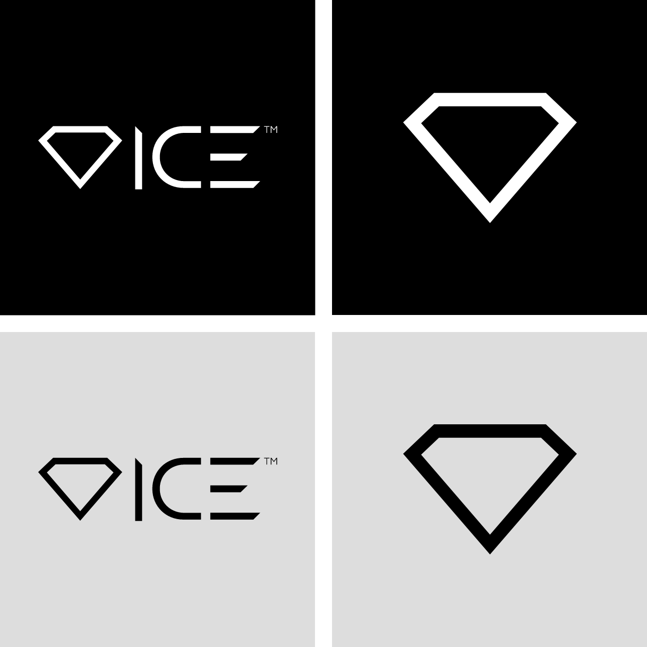
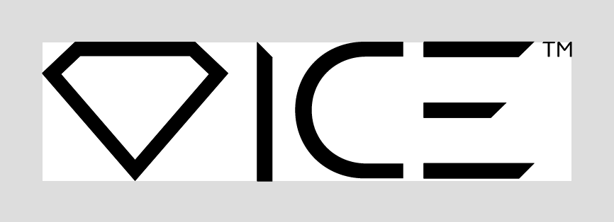
Logo & Symbol
This is the logo and symbol that will be used across all of the brand’s applications. It is essential that the logo and symbol, including Trademark (TM) always be applied with care and respect in every application according to these guidelines.
Colours
The Genesis logo is made up of one key color. The rest of the colors come from a % use of that main color.
Incorrect Usage
A few rules are necessary to maintain the integrity of the brand.
Don’t compromise the overall look of the logo by rotating, skewing or distorting in any way - that includes adding unnecessary and unattractive elements like drop shadows and outlines. Here are some examples of ways you should never consider using the logo.

Logo Placement
To ensure legibility always keep a minimum clear space around the logo. This space isolates the mark from any competing graphic elements that might conflict and lessen the impact of the brand.
There are ways that the logo can be used on photographic backgrounds, but each option should be exercised with care, making sure the logo is always visible.

Typography
Typography is a powerful brand tool when used consistently. This set of typefaces best represent the brand and should be used across all print and web applications.
Montserrat Sans
Butler Stencil
Images
Images are a powerful representation of our purpose, intentions and vision.

Straplines


